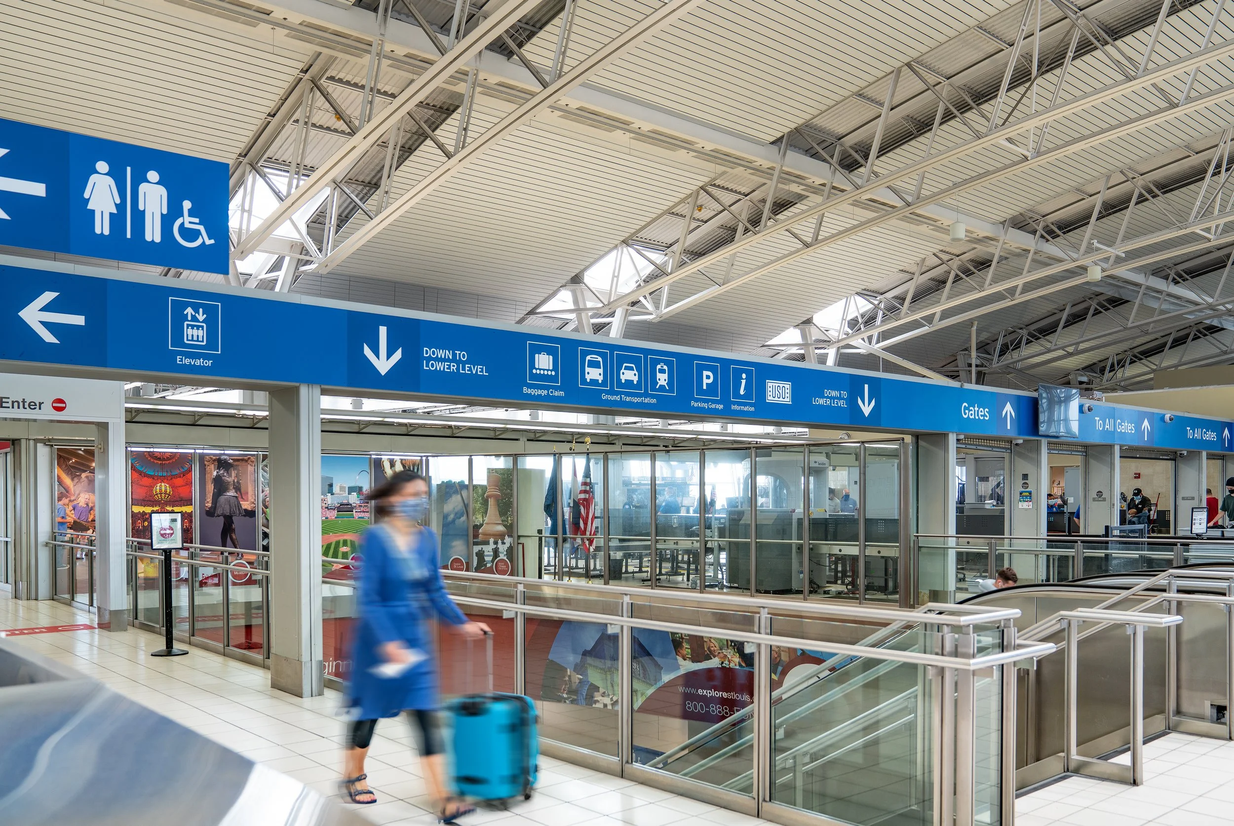
ST. Louis LAMBERT AIRPORT WAYFINDING
Terminal 2 serves one of America’s major airlines. With more than 4.7 million passengers departing from this terminal in 2018, the outdated wayfinding signage was in need of major updates and upgrades.
The goal of the new signage is to reduce visual clutter and deliver an improved visitor experience. The designs take a holistic approach − evaluating airport vehicular traffic, departure and arrival curbsides, and the terminal’s interior areas based on key wayfinding factors including building aesthetics, circulation, sign placement and messaging.
The signage features a clean, consistent look, and uses a clear wayfinding system to help relieve confusion and navigate visitors through the space. The system focuses on key signage elements including message hierarchy, color coding, pictograms and arrows.


